Contents
You love a striped shirt and a floral skirt, but you always wear them with a solid piece. You’re tempted to wear them together, but aren’t sure where to start. Mixing prints doesn’t require a collection of extravagant clothes: two familiar pieces are enough to explore a new combination.
To mix two prints, choose an easy-to-spot connection: a shared color, a clear difference in pattern size, or a balance that lets one piece stand out. These are starting points, not strict rules. You may like a high-contrast combination or prefer a subtle mix; trying it on helps you find the level of visual contrast that feels right to you.
Start with the piece you feel like wearing
Start with one piece. It could be a floral skirt, a plaid shirt, or a scarf you often leave in your closet. Notice what you like: the pattern, the colors, the fabric’s movement, or a memory tied to the garment. That preference gives you a more concrete starting point than a rule about which prints can go together.
Next, place a second piece beside it, without adding a jacket, bag, or jewelry yet. Look at the two prints together. You might find the result cheerful, too busy for your mood today, or simply new. That first impression doesn’t have to be final: wearing the clothes changes how much of each print you see and how the fabrics move.
If you’re looking for a place to start, the guide to find your personal style can help you tell what you actually like from what you think you’re supposed to wear. The goal here is to expand your options using the clothes you already own.
Find a color that runs through both pieces
Look at the colors in each print. A skirt with large rust and navy flowers can go with a top with small rust polka dots. You don’t need every color to match. One visible color echo can be enough to tie the look together.
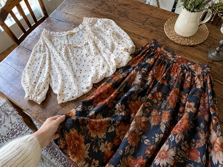
Compare the backgrounds, too. Two prints on light backgrounds look different from a light pattern paired with a dark one, and vice versa. If you like the patterns but the combination feels too high-contrast, bringing the background colors closer is one idea to try. On the other hand, stronger contrast may make the mix feel more intentional to you.
Don’t look for a perfect color match. Fabric, folds, and light can change how colors look when worn. Simply lay the clothes near a window, then try them on. The guide to pairing clothing colors offers more pointers if the color palette is more of a challenge for you than the prints.
Compare the size and spacing of the patterns
Two prints can share colors and still have different rhythms. Small, closely spaced checks create a visually dense surface; wide, spaced-out stripes leave more open areas. The contrast can make the two pieces easier to tell apart.
First, try a small print with a larger one. A pinstripe shirt and a skirt with fairly large flowers are a simple example. Then, if you like, try two prints of a similar size. You can compare the effect without treating the second try as a style mistake.
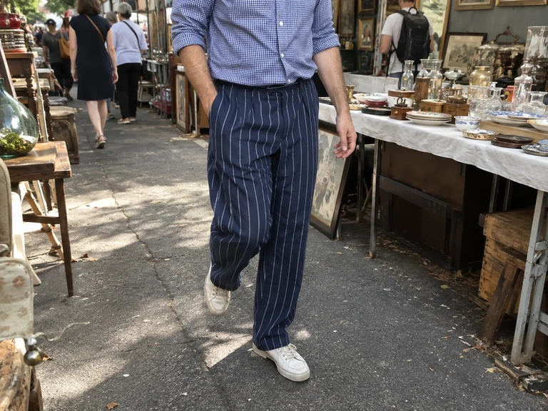
How much of each print shows also matters. An open shirt over a solid top shows less of its print than a buttoned-up shirt. A tightly tied scarf shows a different part of its pattern. Before ruling out two prints, try changing how they appear in the look.
Start with an accessory if you prefer
You don’t have to pair a printed top and bottom right away. A scarf with a Breton-striped top is already a way to compare two patterns. You can take off the scarf if you want a simpler version later in the day. That flexibility makes it easy to try without much commitment.
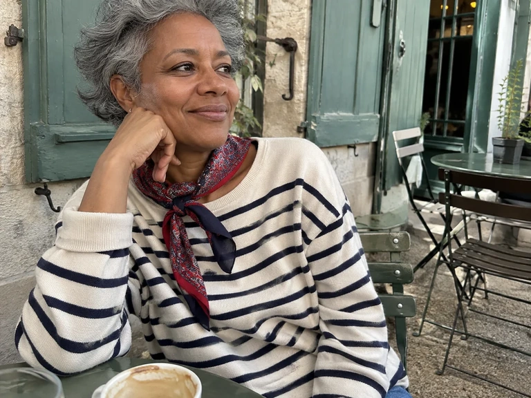
A printed bag can also go with a patterned garment, but think about how you’ll actually use it. Will the bag stay on your shoulder, on your desk, or in the coatroom? If you want to enjoy the mix all day, an accessory you take off right away won’t play the same role as a scarf or cardigan.
Choose an accessory that doesn’t get in your way. A voluminous scarf can feel great outdoors and become cumbersome when you’re leaning over a table to work. A look that works visually still needs to suit what you’re doing; you can save the idea for another setting.
A visual example from beepworld to compare with the steps in this guide.
Video in English
 Read alsoHow to wear a scarf without overwhelming your outfit: folds, color, and volume
Let a solid piece give the eye a break
A solid-color jacket, shoes, or bag can give a two-print look a place to rest. Start with an accessory you already own. You can pick up a color from the prints, but a neutral you love is another option.
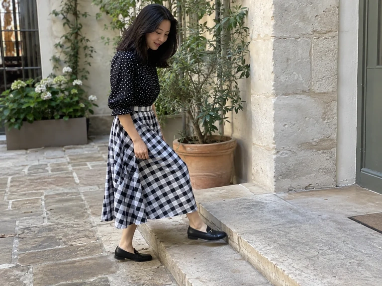
Don’t add a piece just because you think you need to tone down the look. If you like the combination as it is, keep it. The useful question is whether you like and use each piece. A layered look can be intentional; a subtle look can also bring together two prints.
Finally, look at the whole outfit with your shoes, outer layer, and the bag you plan to carry. A mix that works without a coat can change when you add another large print. Then you can choose a solid-color jacket or simply embrace a third print if that’s what you feel like.
Outfit ideas
Choosing your first print combination
Cream and rust polka-dot top, floral skirt with a touch of rust. Start with solid-color shoes and look at the complete outfit.
See all ideas
Shared color
- Cream and rust polka-dot top, floral skirt with a touch of rust. Start with solid-color shoes and look at the complete outfit.
- Blue plaid shirt and a printed scarf with blue in it. Try two ways of tying the scarf to vary how much of the print shows.
Different scales
- Fine-striped Breton top and a skirt with large flowers. Keep the background colors close to simplify your first try.
- Small-check shirt and wide-striped pants. Compare the shirt buttoned up with it open over a solid-color top.
Small accent
- An outfit with one printed piece and a patterned scarf in a small area. Take it off, then put it back on for an easy comparison.
- Printed dress and a small patterned bag that picks up one of the dress’s colors. Check the outfit with the jacket you actually plan to wear.
Keep a record of your try-on
A new combination may take a few minutes to feel familiar. Walk around, sit down, and see how the prints look as the fabric moves. If you like the result, notice what brings the pieces together: a color, similar backgrounds, different scales, or simply a feeling you enjoy.
In Vestly, you can bring the pieces in your wardrobe together and save the looks you’re excited to wear again. Virtual try-on helps you explore a combination, but check the pattern details on the actual garment. To keep experimenting, put together a simple version and a higher-contrast version around your favorite piece.
Frequently asked questions
Can you mix stripes and florals?
Yes. Try a shared color, similar backgrounds, or a clear difference between the size of the stripes and the flowers. These are ideas to try, not requirements. Keep the combination you like when you wear it.
How many prints should you mix?
Two are enough to start and figure out what you like. You can add more later if you want. There’s no universal number for a successful look; what matters more is what you feel like wearing and how you’ll use each piece.
What if the mix feels too busy?
Change just one thing: choose a smaller print, take off an accessory, or add an open solid-color layer. That way, you can pinpoint what feels off without giving up on the whole idea.
Sources and references
- Vestly, prints and saved looks, accessed September 30, 2026.
- Print combinations are editorial suggestions to adapt to your preferences.