Contents
To pair clothing colors, start with a neutral base (black, navy, gray, camel, or white) and add one or two colors, using one of three types of combinations: tonal, neighboring colors, or complementary colors.
Many people wear black, gray, and navy not because they love them, but because they feel safe: pairing colors seems risky. But harmonious combinations follow simple principles, the same ones painters and interior designers use. Once you know them, you’ll feel more confident experimenting and are unlikely to get it wrong.
Here are the basics of the color wheel for clothing, the famous three-color rule, and easy outfit combinations to recreate.
The color wheel in two minutes
The color wheel arranges colors in a circle: yellow, orange, red, purple, blue, green, then back to yellow. Colors next to each other on the wheel, like blue and green, are called analogous; colors opposite each other, like blue and orange, are complementary. Each color also comes in lighter, darker, brighter, or softer versions.
When getting dressed, keep three ideas in mind: neighboring colors feel soft and harmonious, opposite colors add contrast and energy, and neutrals tone everything down.
Neutrals: the foundation of every look
Black, white, gray, beige, off-white, camel, navy, chocolate: neutrals pair with one another and give colors a backdrop. Build your wardrobe around two or three neutrals, then add a few colors, and everything becomes easy to mix and match. That’s the idea behind a capsule wardrobe. Navy is the easiest neutral of all to wear: see what to wear with navy blue.
Keep in mind, though: not every neutral suits every complexion. Color analysis can help you choose the right ones for you, such as navy instead of black or cream instead of pure white. For a specific pairing, like black and brown, the guide pairing black and brown explains the shades and textures.
Three ways to pair colors
Tonal dressing (monochrome)
Wear several shades of the same color: a sky-blue sweater, navy pants, a blue-gray coat. It’s elegant, elongating, and almost impossible to get wrong. Mix textures to keep the look from feeling too uniform.
Neighboring colors (analogous)
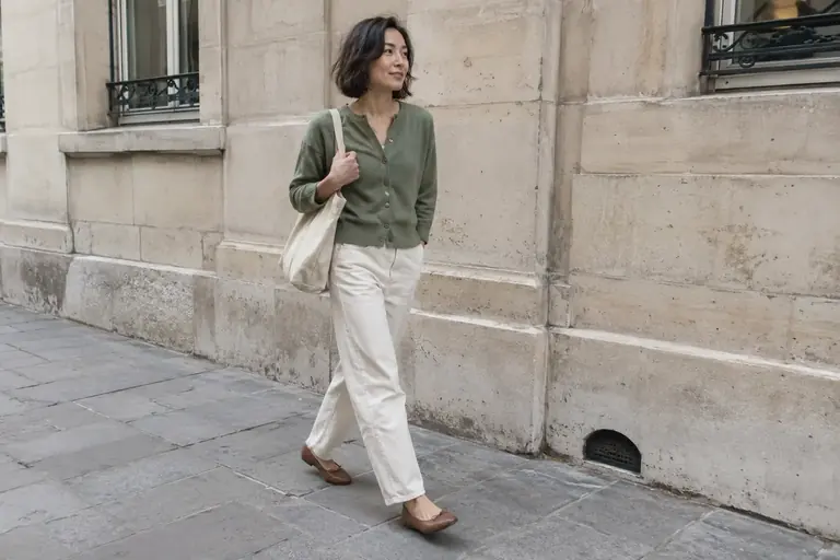
Pair colors that sit close together on the wheel: blue and green, orange and red, pink and purple. The result is harmonious and a little richer than tonal dressing. For example, try a sage-green sweater with teal pants.
Complementary colors
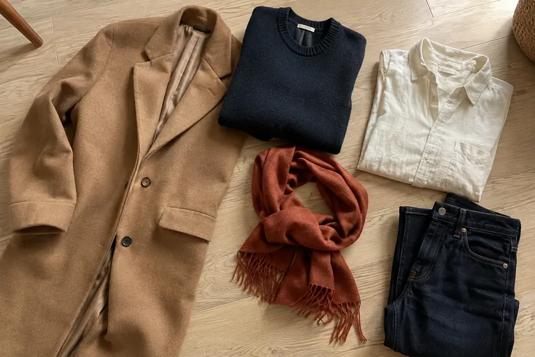
Pair opposite colors: blue and orange, purple and yellow, red and green. The contrast is strong; to make it look elegant, play with the shades, like navy with camel, a softened orange, or keep one of the two colors to an accessory.
The three-color rule
The rule most often cited by image consultants: no more than three main colors in an outfit, including neutrals. That doesn’t rule out prints or shades, but gives you a framework to avoid a patchwork effect. An outfit in navy, white, and camel follows the rule; add a red bag and you’ve got an accent.
A visual example from Christina Mychas to compare with the steps in this guide.
Video in English
 Read alsoHow to put together a harmonious outfit with what you have
Create a common thread
Repeating a color in two places ties the whole look together: a rust sweater and a rust-patterned scarf, a blue shirt and blue sneakers, a belt and a bag in the same shade. This simple echo makes an outfit feel intentional, even when the pieces are very different.
Prints are another valuable tool: a printed skirt often includes two or three colors you can pick up in your top and accessories. It’s an easy way to putting an outfit together without second-guessing.
How to pair prints
Prints follow the same principles as colors, with one extra rule: scale. You can wear two prints together if they share a color and differ in size, such as a fine stripe with a large floral print. Two prints of the same size and intensity tend to compete.
To start, pair a print with solid pieces that pick up one of its colors. Classic prints like nautical stripes, houndstooth, or polka dots work almost like neutrals and pair easily with other prints. The guide to mixing two prints explains which scales and colors to pick up.
How to wear bright colors
Bright colors are easier to wear in small doses: an accessory, a sweater under a neutral jacket, or a pair of shoes. The guide to wearing a pop of red offers practical examples. Once you feel comfortable, try a full bright piece paired with neutrals. A colorful head-to-toe look with several bright colors is the boldest option: it works best with neighboring colors of similar intensity.
To apply a color echo to one specific detail, try our guide to matching or contrasting your belt and shoes. It compares actual pieces and belt visibility, with a color diagram that remains an example rather than a measurement.
Frequently asked questions
Can you wear black and navy together?
Yes—it’s an elegant pairing, as long as both shades are true to color and the fabrics are different, so the contrast looks intentional.
What colors go with khaki?
Khaki pairs well with white, ecru, camel, black, navy, rust, and dusty pink. It’s a near-neutral that’s incredibly versatile.
Do brown and black go together?
Yes, especially with a warm brown like cognac or chocolate. The old rule against wearing them together is long outdated.
What colors go with burgundy?
Burgundy pairs with dusty pink, camel, gray, navy, olive green, and off-white. For a tonal look, pair it with plum or brick red to create a rich, warm outfit that’s perfect for fall.
What colors go with orange?
Navy, denim, off-white, and chocolate brown make a great frame for orange. For a softer look, terracotta orange pairs well with ecru and olive green. Bright orange works best as an accessory against neutrals.
What colors go with pink?
Dusty pink pairs with gray, navy, camel, white, and burgundy. Bright pink looks better with neutrals like black or white than with another vivid color.